
Text to Visual
Many Materials. One System.
Mobile-first learning materials for nutrition, training and lifestyle. A coach’s text-heavy A4 documents, redesigned into one consistent visual system built for the phone screen.
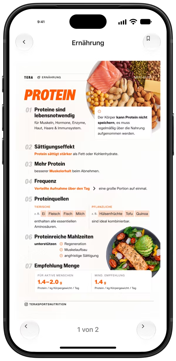
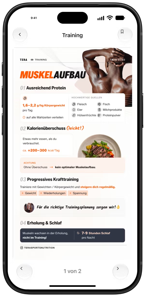
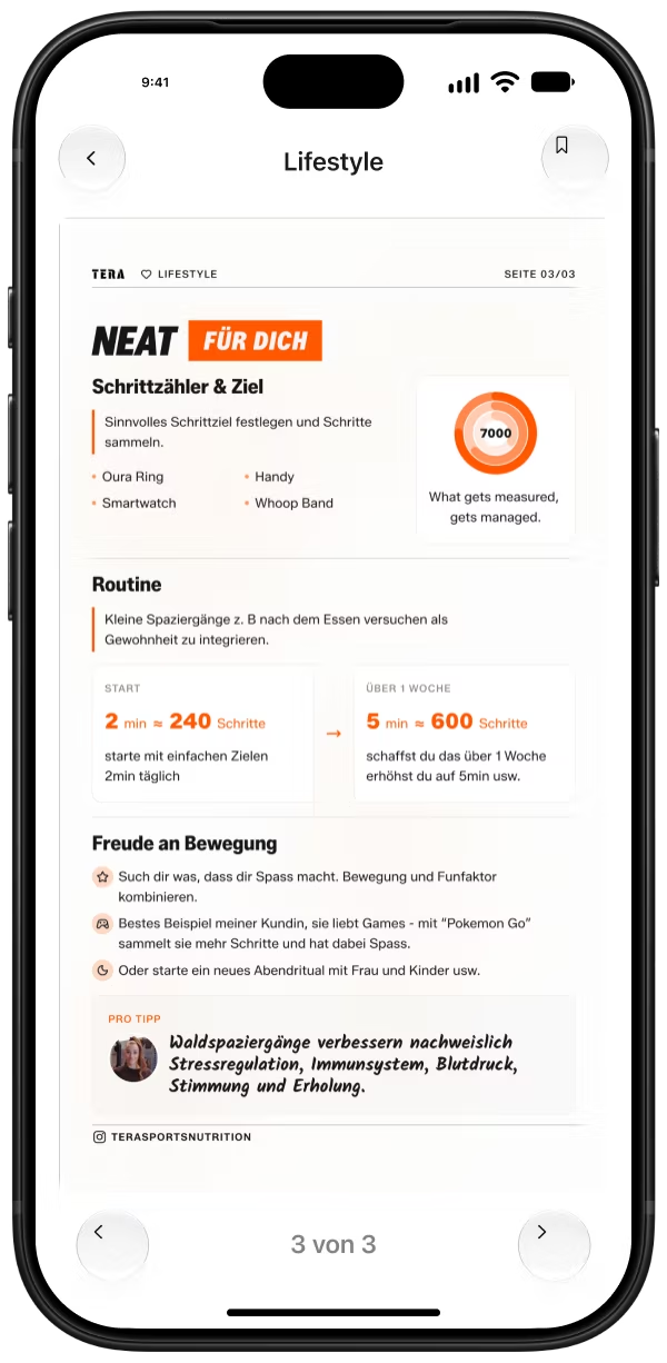
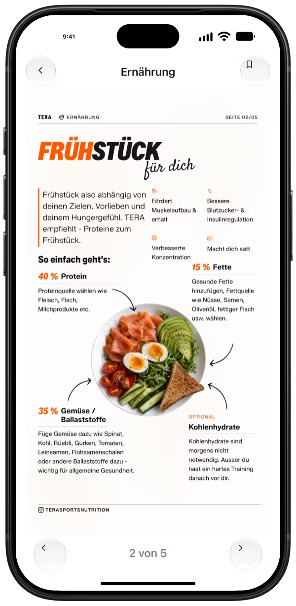
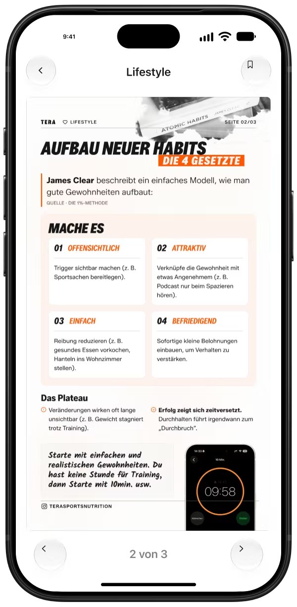
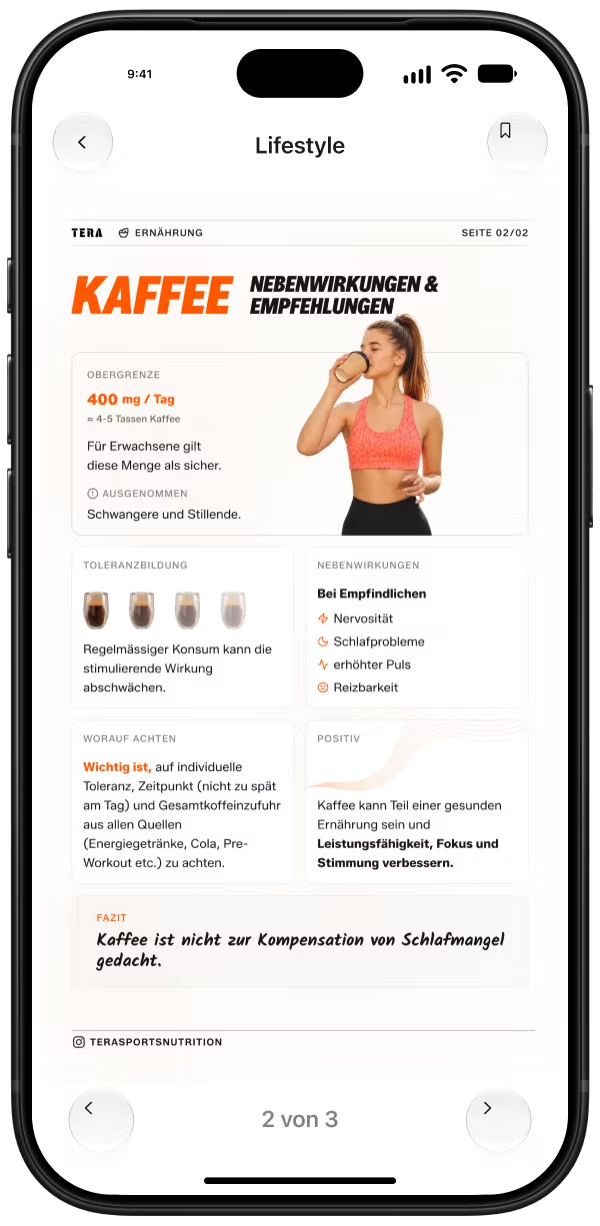
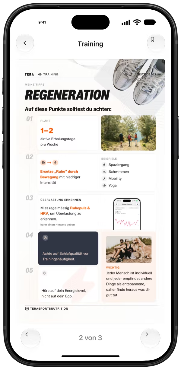
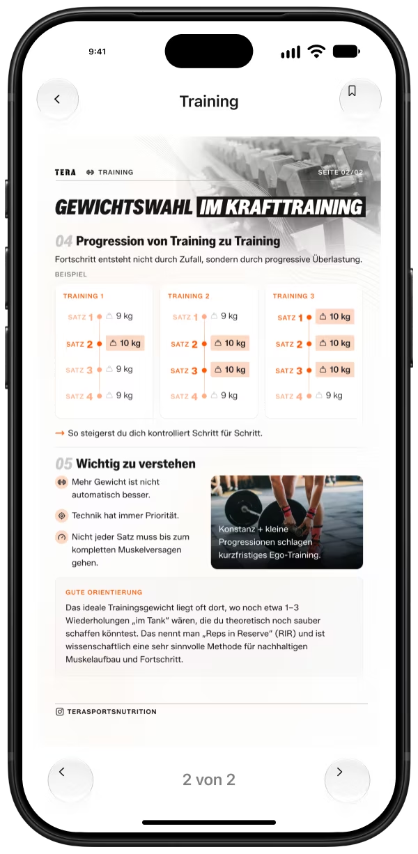
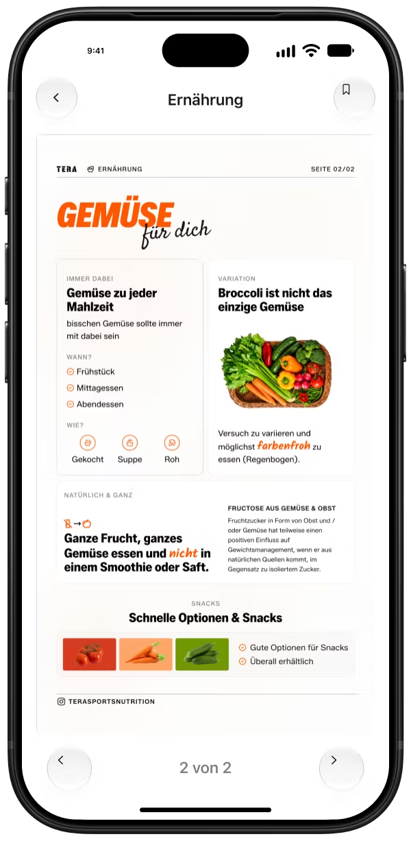
100+ materials,
none made for the phone
The client — a sports and nutrition coach — had built up more than 100 learning materials over the years. The content was valuable, but the documents were dull to look at, unstructured and awkward to read on a phone: A4 layouts, mismatched fonts and colours, no shared system.
The goal: one consistent, modern and premium visual identity for all of them. Content that is clearer, easier to read and more engaging, with reusable templates that keep every future material consistent.
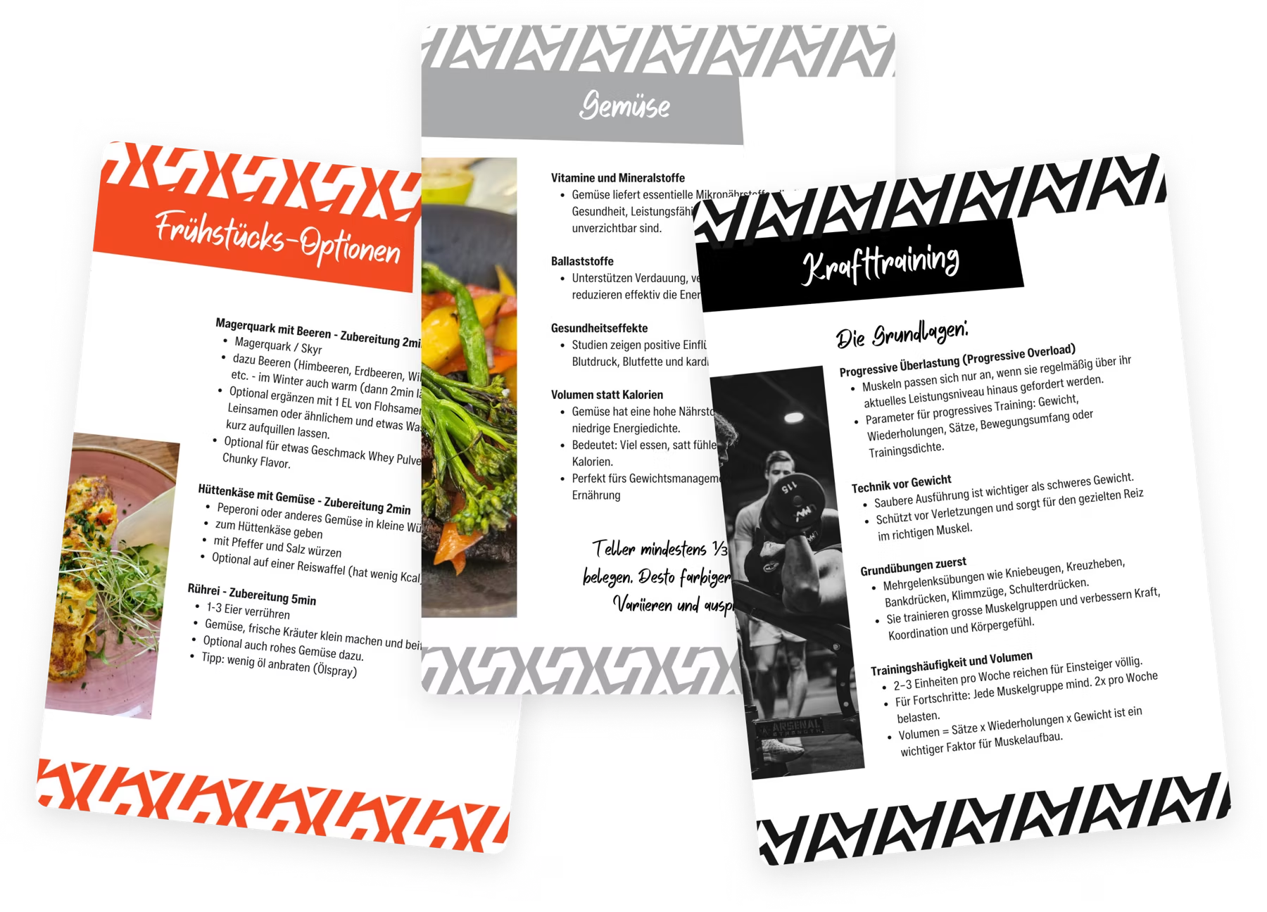

From dull documents
to one visual system
The process started with an audit of the existing materials: what works on a phone, what doesn’t, and why no two documents looked alike.
From there the project moved step by step — format first, then the design system, then a library of reusable blocks — before a single material was rebuilt. Every card is now made from the same building blocks, so new materials stay consistent from the start.
A4 → 9:16
Moving from A4 to 9:16 makes better use of the phone screen. The 1080 × 1920 format provides more vertical room for the content, while consistent margins create a clear framework for a more open, readable layout.
Design System
Shared colours, typography and spacing rules unified the existing materials and established a reusable foundation for future cards.
An dein Level, Körper und Beschwerden angepasst. Standardpläne können ausreichen, machen aber auf höherem Level kaum noch Fortschritte.
Block Library
Reusable content blocks support different types of information while keeping existing materials and future cards visually consistent.
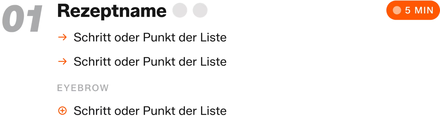
- B1 Intro quote
- B2 Benefit grid
- B3 Numbered section
- B4 Recipe item
- B5 Bullets
- B6 Tag chips
- B7 Info card
- B8 Tip card
- B9 Conclusion band
- B10 Checklist
- B11 Reference item
- B12 Contents group
- B13 Bento cards
- B14 Annotated plate
- B15 Timeline
- B16 Snack row
- B17 Photo treatments










Same Content,
New Structure
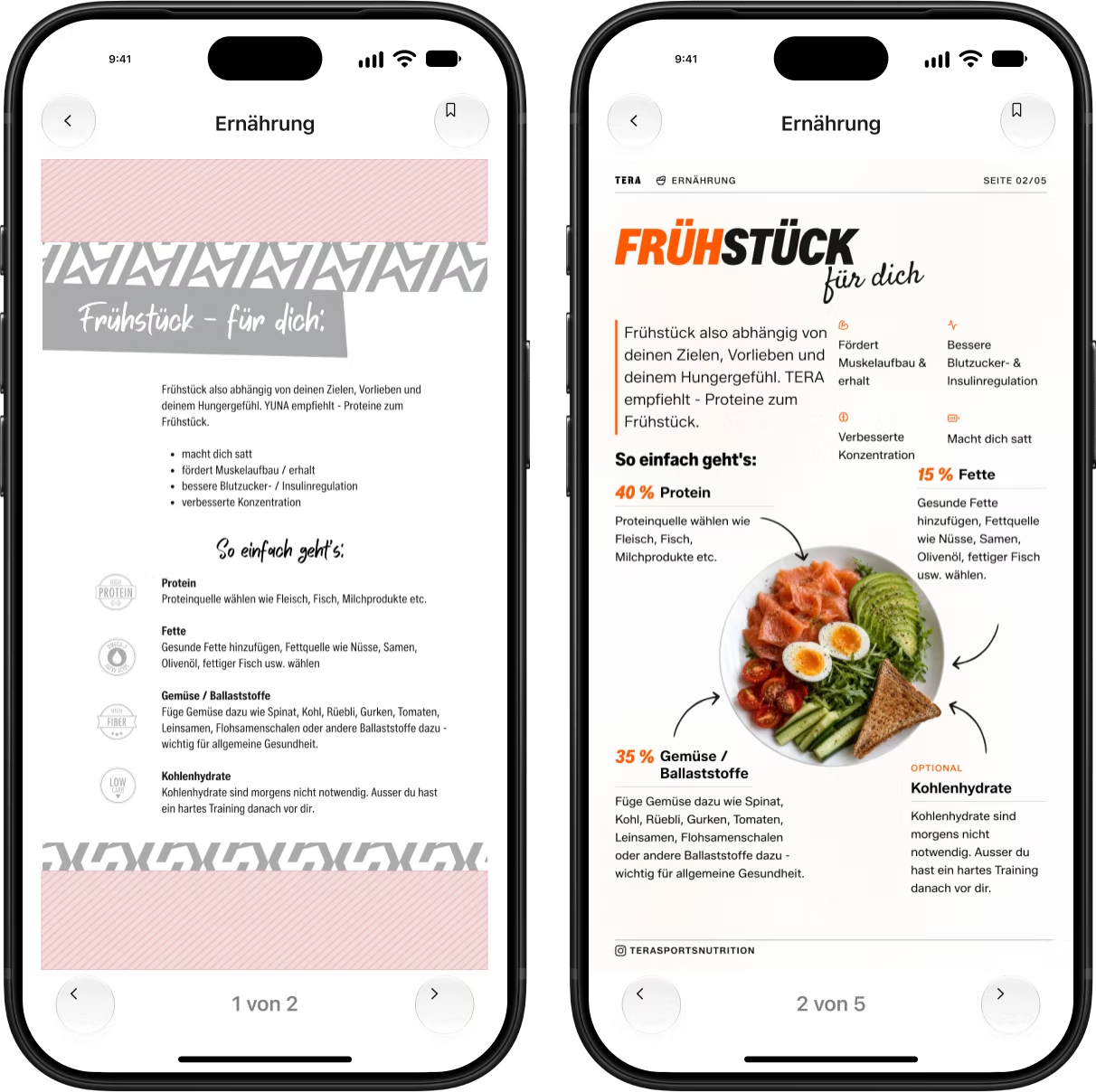
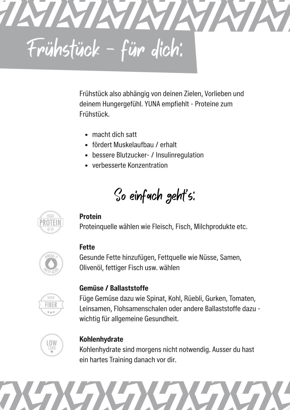
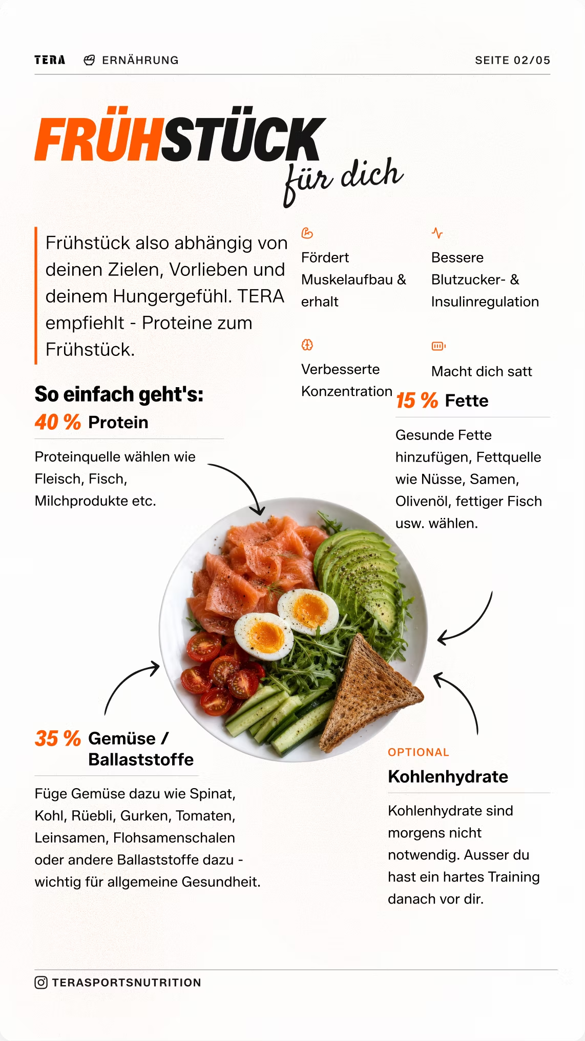
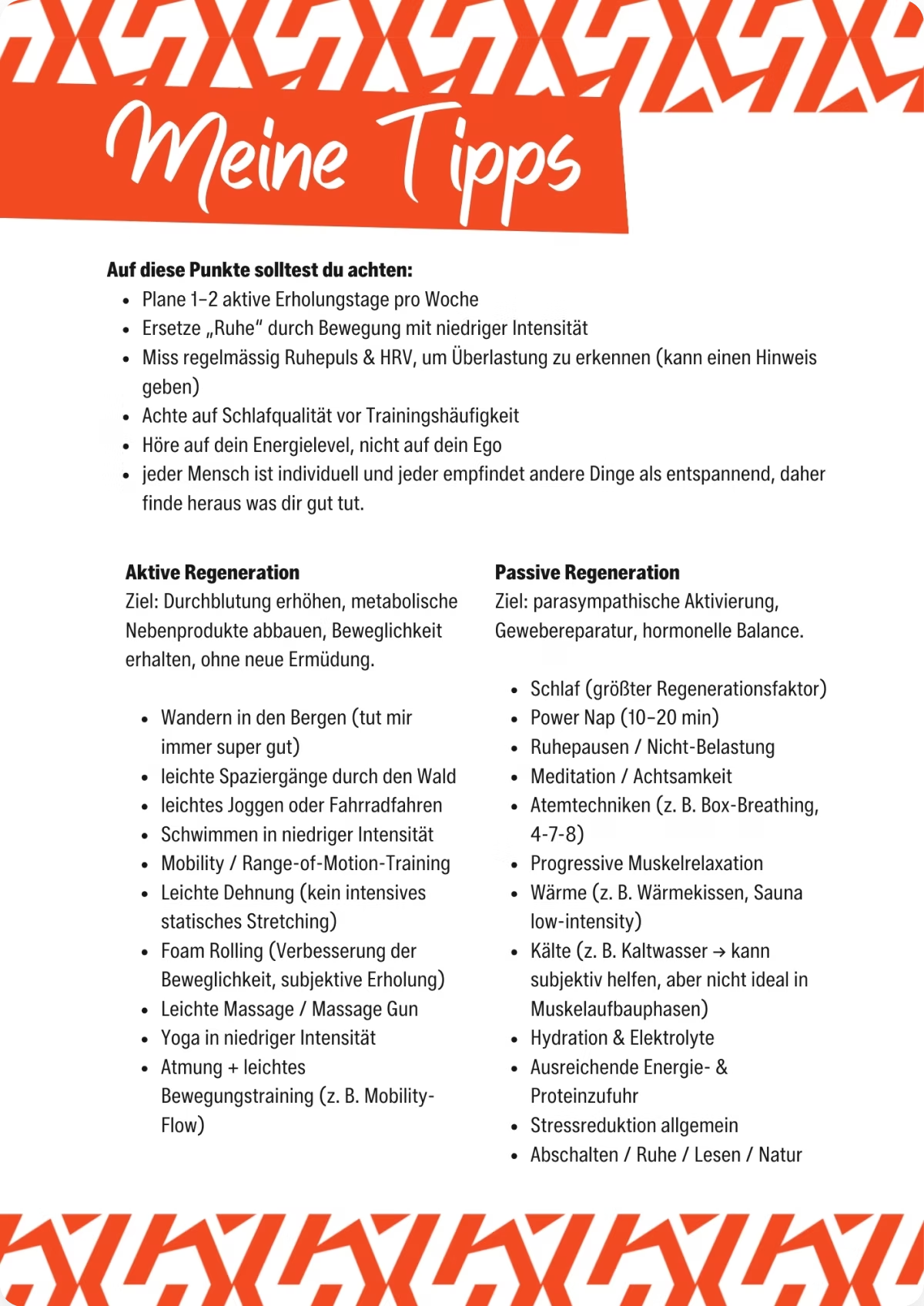
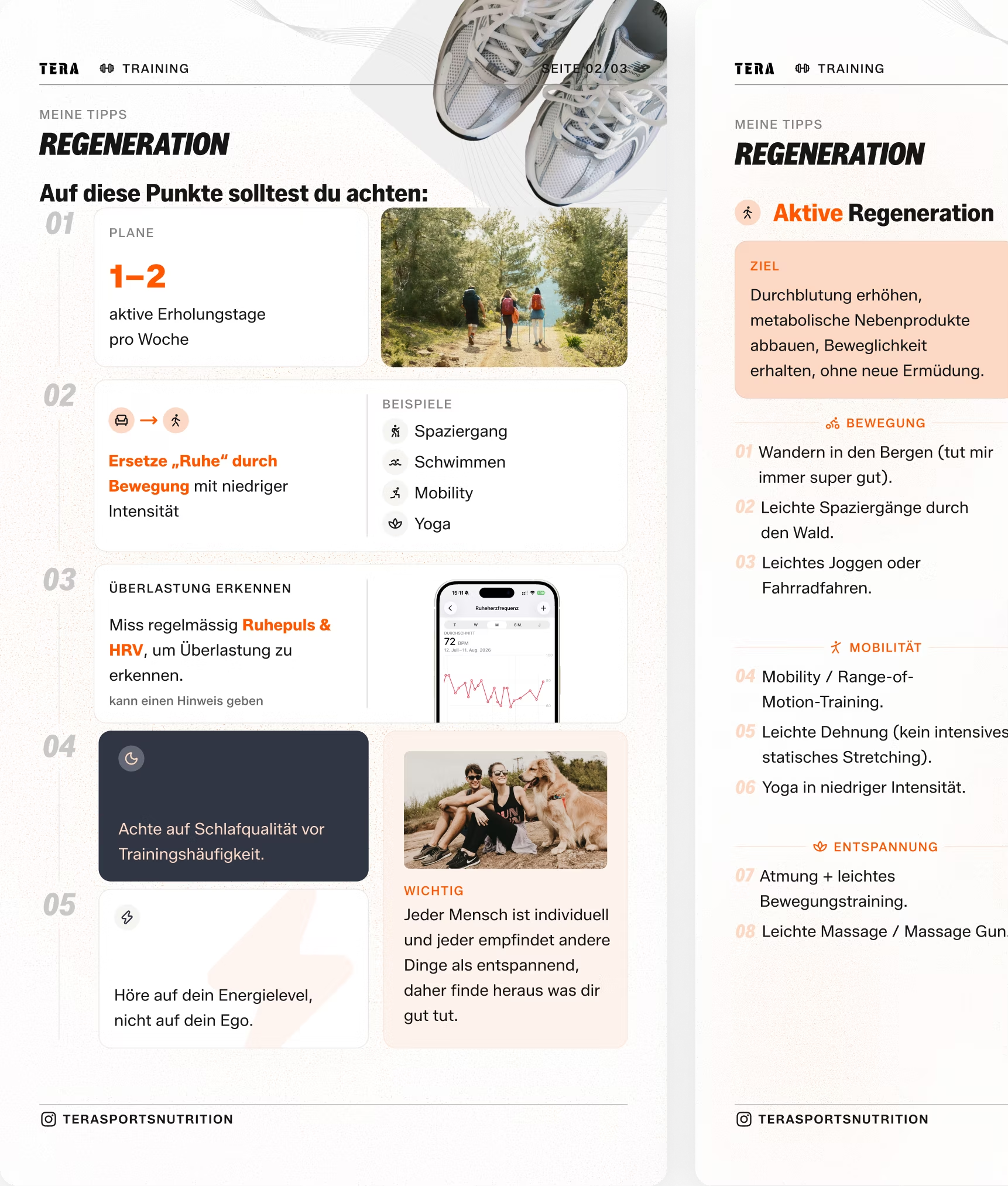
Three of the cards, before and after the redesign: what changed in each one, and why.
A text-heavy list became a visual breakfast guide: clear sections, food imagery and annotations around the plate.
Separate instructions now read as one connected composition, so the idea lands at a glance instead of line by line.
One crowded page was split into two cards, with numbered points, photos and icons.
The original packed too much into dense text and lists, which made it hard to scan. Two cards leave room for clear sections, a stronger visual hierarchy and a lighter, more readable layout.
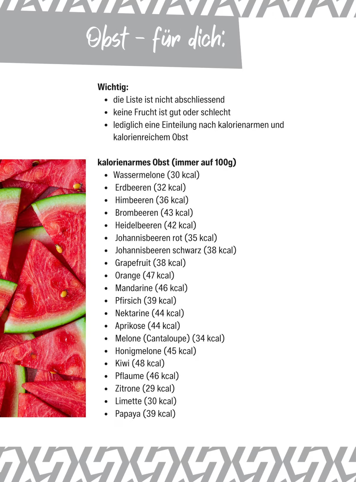
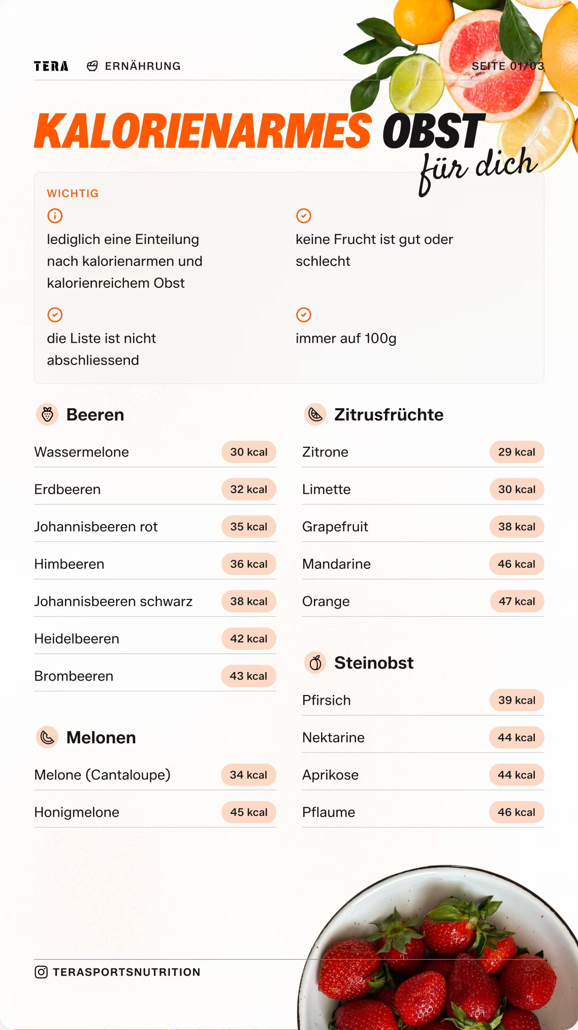
A long, unstructured list was reorganised into fruit groups, with calorie values shown in consistent badges.
Grouping and badges make the card easy to scan, so readers can find a fruit and its calorie content quickly.
One System, Many Cards
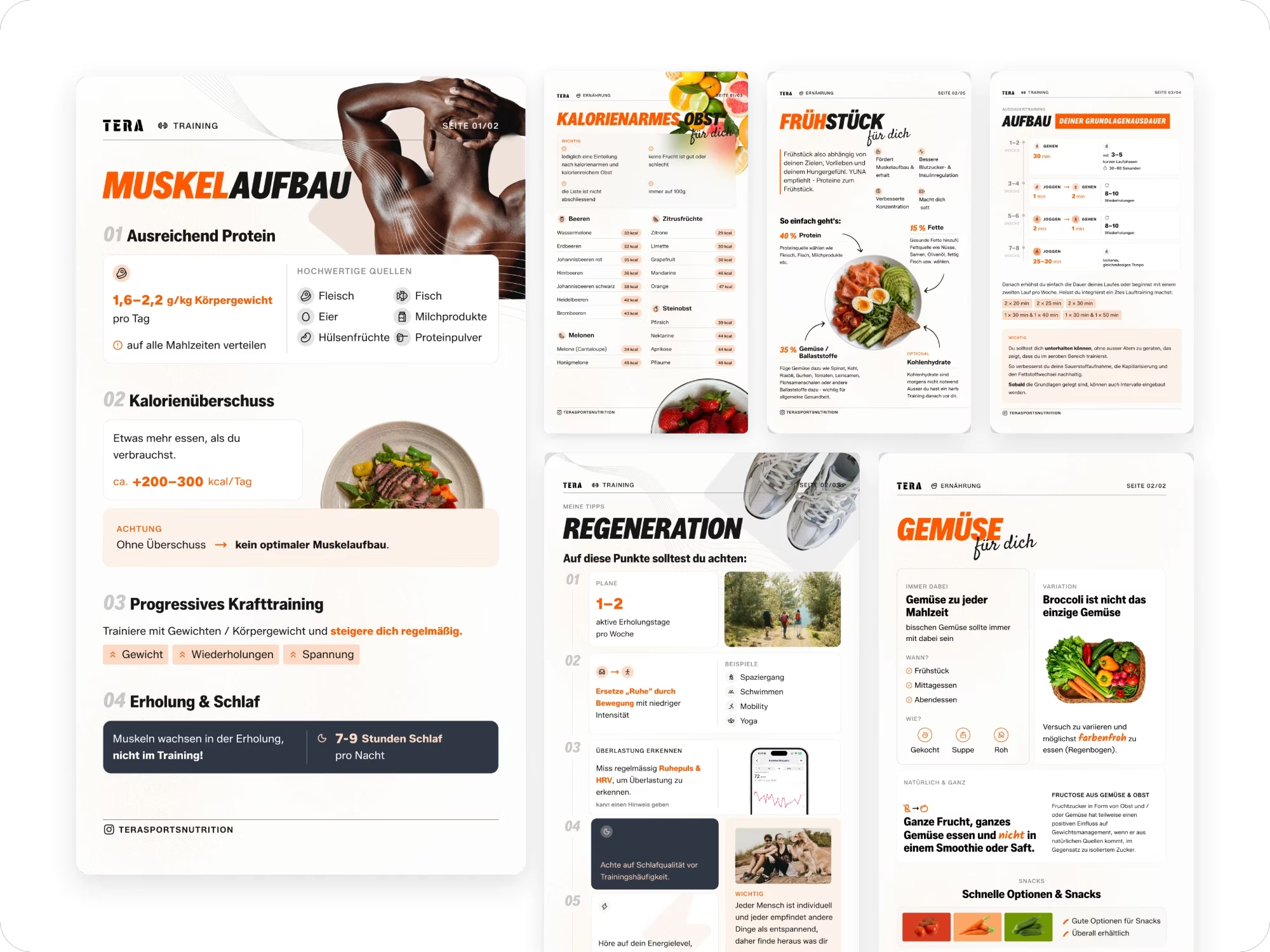
A consistent set of mobile-first cards for nutrition, training and lifestyle, built from the same blocks, colours and typography.
Client Feedback

I had a great experience working with Anna! She redesigned and improved the visual appearance of my existing materials, making them look much more professional, modern, and polished. She paid attention to the details and delivered exactly what I was looking for. I'm very happy with the results and would definitely recommend her. Thank you, Anna :)